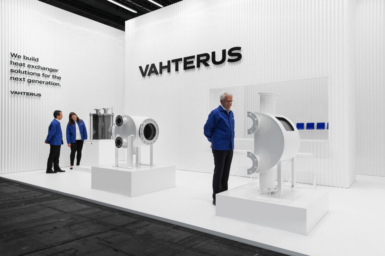
We Have a New Look
Our new visual identity is built on the core idea and values of our company. With a new logo, color scheme, fonts and images, the brand message of Vahterus is clear and confident.
Hanna Kontu, Head of Identity Remake Concept, Board Member at Vahterus
Vahterus’s visual identity has been built up over the last 27 years. During that time, our company has grown significantly. We’ve invented new technologies and suppliedpremium heat exchanger solutions to customers all over the world. This spring, we decided it was time our visual identity reflected the creativity and confidence achieved by our products and business.
The magazine you’re reading is one example of our new visual identity in action. The colours, typography and new brand imagery all follow our updated guidelines.
Visual identity can easily be dismissed as just a ‘look’. However, a meaningful and consistent visual identity is an essential tool in creating and maintaining a brand. It’s a means of direct communication, though often non-verbal.
It’s no coincidence that almost everyone in the Western world knows that the colour of Coca-Cola’s branding is red and could draw a sketch of the Nike logo. Without even thinking about it, we associate an established company with its chosen visual language. The clearer the message, the stronger the effect.
While our day-to-day work and the quality of our products communicate the core idea of Vahterus in a very concrete way, the purpose of our visual identity is to support and strengthen that message.
What is it that we want to communicate?
The starting point for the visual identity remake was recalling and focusing on all those qualities on which Vahterus is built. Qualities such as our Finnish roots, simple and meaningful design, caring for the environment, reliability, trustworthiness, innovation and customer focus have always been fundamental to the way we think and act as a company, and the products we create together.
To communicate these qualities, we’ve updated our logo with a design that’s strong, clean and dynamic. Our new fonts emphasise the straightforward solidity of our products, and our colour palette has been simplified and made bolder to communicate our core values. Finally, we’ve built a distinct brand imagery to showcase our product, people and business. Our new look can be found across all our touchpoints from website to exhibition booth and workwear to business cards.
We made it together
There are a number of people without whom the project wouldn’t have taken shape. In particular, I’d like to thank art director Hennamari Asunta and photographer Anton Sucksdorff for their enthusiasm and dedication to the project. I owe special thanks to writer Sara Karlsson for refining our brand voice, and designer Linda Bergroth forcreating the unique concept for Achema 2018 exhibition, where we launched our new look.
I warmly thank Vahterus’s in-house team Sari Kesälä and Katri Isotahdon for a rewarding collaboration, and all the staff for their openness and help in making this change happen. I hope you enjoy it!

